Browse millions of wholesale art prints from 1+ million independent artists and iconic global brands. Receive 25 - 75% off Fine Art America prices!
3 Years Ago
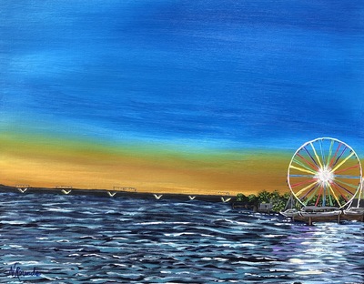
Anyone willing to critique my painting? It’s Sunset at National Harbor. Or maybe you can help me come up with a better name for it. Any suggestions on what I could do better for next time or add to it?
Reply Order
3 Years Ago
i can only speak as if it were a photo. but its very far to the right, touching the edge. too much on the left, its out of balance and looks crooked. those V's, i don't know what those are, and they don't add to the image. the circle could be rounder and more graceful, these are usually covered in lights, so maybe a bit more dazzling looking. the reflection under is nice, though it doesn't reflect the colors, its more like it a moon light. but the wheel itself looks out of place.
name wise, because this is mostly about the wheel, then the park really should be the center of attention name wise.
the wheel is missing its center support. right now it looks like a bike wheel.
mostly this should have at least a 1/4 screen to the right to add balance, the center support, maybe a star light here and there. remove the V's straighten it. i'd also have less blue more yellow in the sky. you could even blend a bit of purple.
----Mike Savad
http://www.MikeSavad.com
3 Years Ago
I'm not good at giving critiques...Mike is great at it...but I can say that I really like your floral paintings.
3 Years Ago
Natalie, a well known British artist Frank Wootton, once gave a lecture at a conference I attended and something he said always stuck with me.
I think this is something that can help you with future works.
As I recall it, Mr. Wootton said, "The 3 most important things that go into a successful painting are composition, composition and composition."
He went on to explain that everything else can be "adjusted" or fixed in a painting: color, value, texture, etc. But if you start out with a flawed composition it's there for the entire painting so you must get it right at the start of your painting.
As Mike pointed out your ferris wheel is right up against the edge and the horizon isn't straight, so they make for a flawed composition.
One thing that I've found helps, is to do a very preliminary small (thumb nail) sketch(s) of what I want the composition to be and adjust that instead of diving right into the painting.
Hope this helps.
Bill Tomsa
https://bill-tomsa.pixels.com
Carlin Blahnik CarlinArtWatercolor
3 Years Ago
Hi Natalie, I love your style! This is a fun colorful painting :)
Mike has a wonderful eye & a lot of good points.
The only thing I might add is your horizon line tilts & I feel the horizon should be horizontal.
I had to google the place to understand what I was looking at.
Now I see how anyone who has been there would recognize the place in your painting!
3 Years Ago
Natalie, I really like your floral paintings too. I just hit the "like" button on a couple of them.
You should "like" your own work as well. You're allowed to do that one time. Just click on the thumbs up button.
As for the one you opened the thread with, I love the colors and everybody else has already chimed in on the rest.
Good luck!
3 Years Ago
When you bring an object close to an edge of a picture you create what is referred to as a tension point. Sometimes a tension point can add excitement and interest to a work but other times it can just be irritating. From the looks of how you photographed the work it looks like you actually touched the edge which for me seems off. In future works I would recommend taking it off the edge or backing it away from the edge somewhat. I am not normally big on the horizon line being straight but in this case I do agree with prior comments. The water is sensitively painted and the strong point of this painting but the sky seems raw, I think that more layering could Benefit this area. Consistency within a work, especially a more traditional painting usually is a good idea. In any case several nice things going on, very close to putting it all together!
3 Years Ago
It doesn't have the composition harmony standard (horizon line on the 1/3 of the image and main subject in the visual harmony spot). So it make cause a certain visual discomfort to people.
On the other hand, such visual discomfort may be the impact and experience you want cause to viewers of the image, to transmit a message such as:
"The amusement fair polluting the natural landscape, as being a discomfort visual object for a eye who wants see pure nature". As if you want to say that the ferris wheel don't belong to the landscape and is its disturbance which is transmitted in the visual experience of the painting.
But it is just an example among many possible message or feeling interpretation of the image composition and framing. Often we, as artists, don't know why we do things as we do (sometimes we believe of convince ourselves to know what we actually don't). Some may never stop to question and find out while others eventually figure it out after months or years by comparing the development of their works. Or sometimes they are just told by somebody else, like Sebastiao Salgado who learned about his "counter light" photography quality when he overheard a teacher showing his photos to pupils in a museum. He says he never though consciously about it but just did by intuition.
According to the visual quality standards the counter light quality is supposed to be "wrong" but in arts there is no such thing as "wrong". But people have this rules in their heads because art is often confused with marketing, decoration and other sorts of things.
You have to ask yourself how you felt when painting such composition. Why did it felt right to you? If it felt uncomfortable but you went along with it anyway, why you did so? Is it because you felt something in you which you could not help projecting in your work or is it just because you tried to reproduce a visual quality looking for approval without actually feeling much from the image you did itself?
If you felt something then there is nothing wrong. If it makes you feel attached to what you did then there is nothing wrong. You may or may not know what it is that you felt but, then, it is an other issue. Art is before anything else to be felt and experienced. The interpretation is just a way people find to justify what they do and to sell what they do (marketing and decoration).
One thing I can tell about your painting is that it feels the world is moving, and it feels it is mooving around the Wheel, as if we have the point of view of the Wheel and the world around it. As if the Wheel is static and everithing round it is moving instead. Just like the feeling we have the sun is going around the earth because we have the earth point of view, when in fact the earth is moving around the sun. The Wheel is like the sun. The Wheel "escaping the image" is as the experience of a dizziness disorientation.
And I like your painting for such feeling it transmits me. And it may tell something about you, which is what makes works of art interesting after all.
Edit: I just checked your other works and your paintings have something about movement in it. Your flowers feels like moving.
Do you mind if I write about your work in my blog?
---
www.marciofaustino.com
3 Years Ago
The water to the lower right is well done.
The white caps other wise are not proportional enough. Or do not evoke a better effect.
Dave Bridburg
Bridburg.com
Post Modern Gallery
3 Years Ago
The mood is cheerful beachy dusk. Not bad for an emotional viewer, there are buyers for these types of artworks.
This painting is defined as an asymmetrical landscape painting but my eyes are drawn to the sunsetting and not to the ferris wheel. Make sure you add some wording in the description about the composition being asymmetrical because there are specific people drawn to this type of art! It's a thing.
Watch this to learn more about asymmetrical landscape art:
https://www.youtube.com/watch?v=AHnvy4-YbYQ
Bob Burrige describes the best practices for asymmetrical landscape composition, I think you'll enjoy the lesson because it's interesting, free and fast paced. His compositions are ....shall we say....oh forget it, but he knows his definitions and can lead a good painter like yourself to asymmetricals that pop!
Although you're not asking for suggestions, I feel like this painting isn't quite done, but excellent excellent start! The water looks like water, the sunset looks like a sunset, the ferris wheel is perfect symmetry, and for those requiring perfection in shapes, you've done superb work!
Now Mike has said that the composition leans to the left, and if you would not want this composition to lean, all you need to do is to straighten it with the crop function and if you want more attention on the ferris wheel simply darken the sky, but this is your painting and your composition and it's going the way you want it to go. To bring out the lights of the ferris wheel, make white and colorful dots along those straight lines, and you'll be done!
Watch my Youtube here to see how I did it with fireworks It's super fast. (1.5 minutes)
Warning: turn speaker down if you're at a day job or work or a baby is sleeping.
https://www.youtube.com/watch?v=fxX0_E2rmKw
This YouTube will show you how to straighten that line of the horizon to perfection towards the end, it's very easy and fun.
https://www.youtube.com/watch?v=YWGy5riO5Rs
3 Years Ago
Following....
Re: super fast video -- you can slow playback down to as low as 0.25 in the YouTube settings, black bar below video, gear icon settings, playback speed.
3 Years Ago
I think you're off to a good start - and asking for a critique can be difficult to do but signifies you want to learn. So I will offer a few observations as best as I can and try not to be too repetitive.
To start, I have another compositional observation - you've got the correct horizontal placement when trying to achieve the rule of thirds - you have the horizon line and Ferris wheel on the lower 3rd - but this seems to leave a lot of negative, or empty space, in the upper 2/3rds. (The vertical rule of thirds is off because the wheel is hugging the right edge, as others have said. Moving it a bit left would help the vertical rule of thirds - and as others have said, the horizon is a bit off kilter).
I like what you've done with the water lines you have and they do a good job leading the eye in. But, as I mentioned, it feels like there is a lot going on in the lower 3rd and not much in the upper third. One thing I do in paintings like this (twilight paintings without a lot of sky detail but where the sky comprises the upper 2/3) is add something like a crescent moon in the upper portion of the sky, in the corner opposite the subject. Perhaps a small crescent moon in the upper left third of the image would help close up that negative space, give it more depth, and establish more of a relation of the spaces of the image. Or layer the clouds more as others have said, as it looks like you were going for a bit of a cloud ceiling. Have layers of clouds that get darker and bigger the higher up in the painting they are. Clouds that are closest to you at sunset are the biggest, darkest, and highest up within the painting.
I like the sky coloring you've done! But I would suggest a bit more of the sky colors in the water. Water should mostly mirror the color of the sky, so the water farthest away would be a gold yellowish color and then gradually turn dark blue until it's very dark up close with bright white caps. Since you're painting kind of choppy water, the white whitecaps was a good decision but the undertones just need a touch more sky color to really pop and look like they are reflecting the sky. Also, in paintings (especially landscape), generally, the farther something away is, the less contrast it has - the shadows are lighter and the highlights are darker - and become more pronounced as they become closer. Your water lines seem to carry the same values all the way to the horizon, but the proportions are very good (getting smaller and closer together the farther away they are).
I hope you find this helpful. I very rarely write critiques, but I too am self-taught and work in acrylics, and you are off to a great start with your painting career and your florals are also very good (way better than anything I'd try to do) so keep at it! I am no expert, and don't claim any of my advice to adhere to the "official rules" of painting because there are no rules, and doing art YOUR way and in your style is the most important thing, but happy to help fellow artists here and there when they ask!
3 Years Ago
Mary- Thank you for the likes and tips!!
Marcio Faustino- I appreciate your thoughts and suggestions. However I ask that you don't use my work or write about in your blog. Thank you.
Ronald- Thank you..I too agree about the sky.
Lisa- I've been watching your videos and they are so helpful thank you for posting! And I will take suggestions or tips any day!! I want to learn---to soak up any help! :)
Chance- Thank you!!! I appreciate the advice!
3 Years Ago
I don't know how to critic, lets see all the good things about your painting.
Lets see what I can learn from your painting.
if I could draw the water like you,
the reflection of the wheel
Color of the sand and the sky,
Colors are matched so beautifully.
I need to learn to paint like this first before
talking about all the lingos like composition and rule of whatever , and fat and lean, bla bla bla.
Some people love to major on the minor.
How many professional photographers took the photo of the same place , just the way you painted. (Google it)
- adjusting up and down or side to side is no big deal.
Then again I dont need any stinking rules, so I do it my way.
Overall, it is a great painting, there is enough to write a book about all the good things, don't just settle for a blog 😊
Wish you all the best!
3 Years Ago
Call me different but I really like the composition, Natalie Rounds. It seems to draw the eye straight to the Ferris wheel. Which of course is the main focal point. Pushing the envelope, as it were, is often provocative.
Presuming the white v shapes are part of a bridge I will say the tonal values are a bit off. The white is too bright and the bridge is too dark.
As for the “slant”? I noticed that the bridge was deeper on the left while on the right it was a tiny bit more narrow: Indicating the left side of the bridge was both further away and higher. Which of course explains the perspective.
Question: Did you paint this plein air, or from a reference photograph. If the latter I would love to see the photograph.
Overall, I think the painting a good one. If you were able to adjust the tonal values on the 'bridge' I would consider it a very good painting.
Title? “Wonderful Wheel on The Water”.
EDIT
Pardon my temporary dyslexia. When speaking of the bridge dimensions I meant to say that the bridge was thicker/deeper/higher on the right and thinner, lower/smaller on the left.
3 Years Ago
Walter thank you for the reply! I’ve been trying to figure out how to add my photo I took to show what I was painting from but I’m not seeing where it will let me add that on my reply. ?
3 Years Ago
I like the impressionist style and think you did a great job with the water which is a hard thing to paint.
I agree with the others about the rule of thirds and think if you could just scoot the wheel slightly to the left it would give it more of that eye appeal.
The rich vibrant colors are nice!
I would like to see you go even more impressionist and soften up some of the hard edges and as Mike said add some of the wheel's colors to that fabulous reflection in the water.
As a digital artist who doesn't paint with brushes much I have to say I don't know if I could do as well. I like the naive style and feeling of the painting overall.
3 Years Ago
I am back to say your florals are really nice and my favorite is the poppies. Beautiful!
3 Years Ago
Thank you Shelli! I appreciate what you’ve said! I would love to learn how to paint more of the impressionist style. I need to learn how to paint more loosely. I know I too often find myself with my nose right up to the canvas and I probably need to step back. I do appreciate everyone’s advice and suggestions here. Soaking it up!
Carlin Blahnik CarlinArtWatercolor
3 Years Ago
Natalie,
Thank you for being so brave in asking for critique! I am learning so much from all the input here.
And like you, my goal is to loosen up my paintings but too often I get hung up on detail. Ugh!
What has helped me to avoid getting sucked into detail while I paint is to make my reference photo simplified. I use any number of free online programs & try various effects until I get something that I think is inspirational.
While I paint, I then refer to the simplified photo instead of the original photo.
It's a fine line to have a painting look "loose" or look like a child painted it :(
Carlin Blahnik CarlinArtWatercolor
3 Years Ago
To add an image to a thread, Abbie created this
https://abbie-shores.com/pixels/
upload your photo & then copy the "Full Image Embed" code and paste it here in the thread
3 Years Ago
Thanks Carlin!! Here’s my photo I had taken that I was going off of.
https://abbie-shores.com/pixels/image/CTto
Or maybe this one if other doesn’t work? I’m not sure what doing here ahaha
https://abbie-shores.com/pixels/images/2020/08/15/CTto.jpg


