Browse millions of wholesale art prints from 1+ million independent artists and iconic global brands. Receive 25 - 75% off Fine Art America prices!
5 Years Ago
Every since my computer crashed a couple months ago, I've been having monitor calibration issues. My monitor does not seem to be displaying reds and oranges correctly. If I get my whites and grays to look right, it's to cool toned. I've had some portrait prints made (professional print place & clicked do not color correct so I can see what my computer is doing) and they printed a little on the red and warm side. I've adjusted my monitor to match the prints as close as possible, but now everything looks to red/warm. Can't find a happy medium. I thought I fixed it a couple months ago, but noticed it was off again. I adjusted gamma and contrast looks a little better, but color is too warm looking to me.
At this time I can't afford to get one of the calibration systems like colormunki or spyder. (Looking for a used one if anyone knows of one). I tried the program calibrize that has worked great on previous hard drive, but for some reason when I get it just right, after clicking save it goes back to the previous setting. Computer isn't keeping the calibrize profile and can't figure out why. The only program it's letting me calibrate with is the Intel HD Graphics and that's the one that is either to cool or to warm.
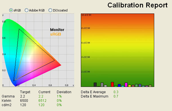
For those of you with calibrated monitors can you tell me what this image looks like to you? To warm? To red? To Cool? ect..
It looked fine on my previous calibration, but now it looks to warm/brown toned with new calibration that's close to prints.
Reply Order
5 Years Ago
There seems to be a bluish cast on the snow to me.
Some very low tech ideas ... one thing you might try, and this is VERY low tech, is once you've posted an image, take a look at it via your cell phone. If you have one of those pad things, give that a try too. Before we moved, I'd go into the Apple Store and pull up my stuff on their computers, too, just for giggles. Also ... one of the things I do is once my image is in one of the groups here, I look at my stuff to see how it compares against the other images. I've found that once I look at my images for too long, my brain tells me to see what I WANT to see rather than what is actually there. That's especially true for lights and darks.
There are also a few online calibration tests ... you might find one you like. I've never been wild about them.
Again, horribly low tech, but hope it helps.
5 Years Ago
Thank Lois. When I calibrated to try to match the prints, I also compared with my phone and the phone is more on the cooler/bluer side. I've just never had issues with the print place before so if it's looking blue on your end, then maybe I should be matching more my phone instead of the prints. Maybe the print company was off. But, I'm also comparing printed images on a magazine too and they too are printing warmer than my computer screen is showing.
5 Years Ago
Yeah, exactly. I've spent hours that I don't have trying to get it right.
Is anyone else seeing the image above kind of blue?
5 Years Ago
Yes I see a blue cast,,just a scooch to cool
I use this one: https://www.ebay.com/sch/i.html?_from=R40&_nkw=i1+display+pro&_sacat=0&rt=nc&LH_ItemCondition=4
used to use this,,
5 Years Ago
I calibrated again to make it a little more cooler. It looks fine to my eyes on computer but when I hold a print up to monitor, the print looks a little more green now lol.
Now with this new calibration, the above photo looks a little blue in snow, and then this image also looks more blue. What are you seeing with this one?
5 Years Ago
The snow is much whiter in the second one.

Most of the pine trees are a bit too blue though...

The reflection of the sky and the naturally blue cast of pure snow can become an issue that can be tough to deal with at times, even on a calibrated monitor. Using the levels eyedropper on the snow in PS seemed to do a good job on the photos you posted, white snow and it removed much of the blue from the tress.
http://sciencenordic.com/ice-makes-snow-white-blue-and-creaky
Cheers
5 Years Ago
Hey Jennifer, today may be your lucky day. I have a Spyder 3 Express setup that's yours if you want it. Comes with the Spyder 3 colorimeter and software disk. It's pretty basic as far as calibration tools goes, it won't do multiple monitors for example, but up until I upgraded to the Spyder 5 I was very happy with the results. Though I was admittedly not all that anal about prints matching the monitor exactly. DM me your info and if your willing to cover the $15 or so I'm guessing Priority Mail would be, it's yours. Definitely make sure it will work with your computer first though as it is an older setup.
5 Years Ago
Thanks Don. I guess my monitor was more correct before trying to match prints. Maybe printer co is off.
That would be awesome Jeff! I'm msg you.
Since I do portraits and also own a magazine where my portraits are printed. It's extremely important for my prints to match my monitor. The first print right after my computer crashed was way to red and embarrassing. My computer monitor didn't show that at all. So I don't want that to happen again.
5 Years Ago
Jennifer,
I only have a little experience in this so bear with me.
Are those two shots on overcast days? Meaning less light? As we probably all know shadows are blue.
I am not clear on what you are doing. If the days were overcast.
Dave
5 Years Ago
Hi David. I'm just trying to figure out what everybody is seeing in the white and in the Trees of the photos. My new calibration was showing everything a little too brown or warm toned. I could hardly see any bluetones and I know snow should have a slightly light blue tone. They were both taken on overcast days.
5 Years Ago
I remember some years ago setting up a color profile file for calibrating. How would you stray from such a file? I thought that was universal?
Dave
PS, I would not try to go in with controls by hand to calibrate.......you are not doing that?
PSS I had a good friend with a Spyder. I see you might be going in by hand. That really is not doable.
5 Years Ago
Jennifer,
Still on the LOW TECH theme, here's a "tool" that I made to help adjust monitors, by hand....
Here is the same set up of the Macbeth Color Chart and the 2 Kodak 18% Gray cards. As can be seen, the smaller gray card is s slightly different shade or color of the larger one underneath. This was captured in shade 12:00 pm,pretty overcast skies,actually raining skies! . Here's what Photoshop's White Balance tool sees for the smaller gray card:
Red = 117
Green = 117
Blue = 118
The larger gray card shows up like this:
R = 116
G = 115
B = 112
So in theory, and in shade/overcast, the smaller Kodak 18% Gray card is more accurate, but really splitting hairs and could be my Canon Sensor too.
Rich
5 Years Ago
Dave,
"How often should my monitor be recalibrated or reprofiled?
As you can imagine, this depends on the stability of your monitor and how particular you are about its accuracy. We typically suggest a minimum of once every two weeks. In demanding environments you may want to recalibrate once a week or even every day."
http://www.colorwiki.com/wiki/Monitor_Calibration_FAQ#How_often_should_my_monitor_be_recalibrated_or_reprofiled.3F
That said, I don't recalibrate my newest monitor all that often, but monitors and conditions do change. On some of my old monitors I was always recalibrating. My current second screen is aging in comparison to my new one, and it's not as stable as it used to be. I keep it around because it's a nice wide-gamut monitor.
5 Years Ago
Rich,
I forgot about that method. Yeah particularly getting the gray scale correct is the beginning of that.
addition was it Wolf Faust or something that sold the cards? What I am thinking?
Dave
5 Years Ago
David,
B&H for sure, not cheap though! Here's one that I made for people on a tight budget!
Rich
5 Years Ago
http://www.targets.coloraid.de/
Rich,
You have to be careful which card you buy, but these are cheap and excellent.
Dave
Might only be good for scanners
yep no good
5 Years Ago
Thanks Rich. That's awesome and will be a great help. I messaged Jeff above and waiting for a response back to see if I can buy his spyder 3.
David - I had some photos recently printed and they printed on the warm side and the reds were more dominate than my computer was showing and it had me worried. I've been having calibration issues with this new hard drive that I had to start from scratch because my other one crashed. I have an ASUS laptop and the ASUS parts of the computer don't really like the new hard drive. It keeps telling me the Asus programs will only work on ASUS because it's not recognizing the new hard drive.
Also with it being a laptop, I do have different areas of the home I work in and those are different light conditions. My previous system was calibrated and didn't have to check it but every few months or so, but this one is being a pain. It's driving me nuts lol.
5 Years Ago
Jennifer,
Have you updated the driver for the new hard drive?
You are savvy enough. So I am kind of asking regular questions only.
Dave
5 Years Ago
the first thing i'd do is replace the video driver, it may be the wrong one, wrong model, os, or whatever.
then clear out any profiles that are there, there should be a default sRGB, it may be looking at the wrong one.
then i'd double check to make sure the cords are tight, it could be a bad cord doing weird things.
the snow scene should have a blue tint to make it look cool, but if you were going for white - its bluish.
also check the color temp in the monitor, it may be set to something strange, the settings on the screen itself.
----Mike Savad
http://www.MikeSavad.com
5 Years Ago
Dave,
Not top end by any means but it was designed for graphics professionals.
It's an LG Color Prime WQHD 2560x1440 with factory color calibration via internal LUT and it swivels to a vertical orientation. They made two versions of this monitor, a 10bit Adobe RGB and a virtually identical sRGB version. Both came with calibration hardware
I bought it a two or three years ago, both monitors have since been discontinued. You can still find a used sRGB model for $320 on B&H. I think LG may be still selling Color Prime Ultra HD TVs.
I didn't want to spend the cash for AdobeRGB version as $440+ was enough for my needs on the sRGB version.
My old monitor is an HP wide gamut which rated great, just slightly lower than the BenQ and Eizio but at half the price, it also swivels to vertical.
It's pushing 8 or 9 years old now and I have the brightness and contrast basically maxed and I also have pushed the blue color channel to the max.
It's not long for the road and I wish I would have bought an AdobeRGB color prime at the same time I bought the sRGB. The LG seems to be holding up well.
My reason for buying an sRGB monitor to go along with the AdobeRGB monitor is I do a lot of stuff that is displayed on the web so it's nice to have an extremely accurate sRGB monitor. My old wide gamut HP is not nearly as good with sRGB as it is with AdobeRGB.
I also have a 40" Sony Bravia that I use as monitor when I have a lot of sorting and viewing to do. In those cases, I replace my office chair with a recliner at my desk.
I will probably replace the old one with is this WQHD.
"PremierColour offers 100% Adobe RGB and 100% sRGB as well as two new colour spaces: 100% REC 709 and 98% DCI-P3"
https://www.dell.com/ed/business/p/dell-up2716d-monitor/pd
Great price and I don't t think I need 4K on 27 inches at my desk.
Who knows, I may change my mind. I don't do anything that requires the absolute top end in color matching so I will probably buy somewhere in the middle.
If I go 4K it might be something like this...
5 Years Ago
Don,
You probably know this and have the graphics card? You need a 10 bit graphics card for the ARGB specs.
I have the ASUS Graphics Monitor 24" from mid 2014. If I had waited a few more months, I would have gone with the new at that time Dell graphics monitor.
I totally get you on sRGB. For this there really is little choice. It is also very good.
Dave
5 Years Ago
Wide gamut does not require a 10-bit graphics card to utilize it. The "maximum range" of the color gamut is the same on 8-bit or 10-bit. A full 10-bit setup would allow you to display more shades of each color within the particular gamut. The difference between sRGB and AdobeRGB can be quite noticeable and even wonderfully drastic. The difference between a 10-bit display setup and an 8-bit display setup is much more subtle, and may not be noticeable on much at all. If you want to display more color then wide gamut is the way to go, especially when you have been working with a wider gamut and/or shoot wider gamut. Even more so if you are doing a lot of print work in anything other than sRGB.
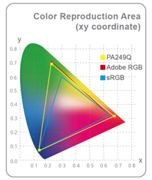
This is what my old 8-bit HP wide gamut does...
As you can clearly see, my 8-bit AdobeRGB gamut is much, much wider than the sRGB gamut.
The difference between 8-bit AdobeRGB and sRGB image viewing is like night and day with some images. Nature images are of course one of those types of images. If someone does not have a wide gamut monitor alongside an sRGB monitor they probably don't realize what they are missing. I have shot many hundreds of thousands of images since 2002 and I'm guessing 90% or more of those were shot in AdobeRGB.
My model is rated at 99% of AdobeRGB. As the calibration report above shows, you can clearly see I have been doing well with 8 bits as far as the AdobeRGB gamut goes.
If money is not an obstacle, your reproduction accuracy is as critical as it gets, and you want to display as close as you can to what you print, then drop some real money on a 10bit setup. For most folks it's just not necessary.
If someone feels like hitting my PayPal account with 20 grand I'll upgrade to two of these or something similar...
https://www.bhphotovideo.com/c/product/1425544-REG/eizo_cg319x_4k_bk_31_1_dci_4k_wide_screen.html
.....and something like this.
https://www.bhphotovideo.com/c/product/1319335-REG/hp_z0b12at_nvidia_quadro_p6000.html/
For now, I work with what I have. :)
5 Years Ago
It is 10 bit GPU with 10 bit monitor to get better gradients. The aRGB offers a better gradient as well if you take advantage of it. That is where the 10 bit systems meet aRGB.
Dave
5 Years Ago
Great info everyone.
Mike & David,
All my drivers are up to date. The only thing changed on computer is hard drive. A friend put it in for me. Since its a laptop I'm afraid to open it. It's one of those fragile not easily accessible laptops.
My latest calibration looks better to the eye but it doesn't match what's being printed from 2 different professional printer places so I don't know what's going on. Ots matchimg my phone & another computer though. I've looked at it so much yesterday & this morning all colors are running together now lol. I took a break from it this afternoon & will try again tomorrow. I'm hoping Jeff gets back with me on his Spyder 3. I'm going to work with Richs suggestion to see what I get.
5 Years Ago
@David,
I think you forgot to read my third sentence above...and I suppose much of the rest of the post as well for that matter.
"The "maximum range" of the color gamut is the same on 8-bit or 10-bit. A full 10-bit setup would allow you to display more shades of each color within the particular gamut."
Something you have missed, which is the point of using AdobeRGB, is its 35% wider compared to sRGB on both 8-bit and 10bit. I have had basically no issues with gradients whatsoever due to the 8-bit display in 8 or 9 years of use. Your eyes probably could rarely detect it anyway, if it ever exists, on this size monitor.
The thing is if you know what you are doing, and you are not shooting for just web work, the colors are almost always better, richer, more saturated, and more accurate. 8-bit AdobeRGB displays have been popular with photographers for more than a decade. Of course, AdobeRGB was developed in 1998.
Heck, I don't think Lightroom even supports 10-bit color output. Trust me, after editing close to 75-100K images on the 8-bit it's not an issue.
I like this 2017 quote from Betty at Photography Life:
"10 bit display has been possible for years but was not practical mostly because very few apps supported it. Even my ancient and now defunct, Eizo CG301W was 10 bit capable – but neither the Mac OS, nor Adobe apps, nor my old Mac hardware supported it, so effectively 10 bit display was out of reach."
It's not been until fairly recently that Apps are finally starting to support 10-bit.
If you have 31 to 35-inch monitors and have shot a ton of skies and oceans, and have a ton of dough, go for 10-bit setup.
Not only that, you actually see the colors closer to your printed output since most people (other than snapshooters and cell phone users) don't edit or print sRGB files if they have a choice, or know what they are doing. Unless, of course, your final destination is the web.
On the other side of the coin, if you want a crappy monitor then use an old TN 8-bit screen that might have only be 6-bit in reality with the worst viewing angles and color shift in modern monitor history.
Quoting you: "You need a 10-bit graphics card for the ARGB specs."
You said a 10-bit graphics card is required for AdobeRGB and it's simply not true. AdobeRGB on a good IPS screen is sweet and the AdobeRGB gamut is covered. The top monitor brands have been selling 8-bit AdobeRGB for a very long time to people that realize how much extra pop they see and what a benefit it is.
As monitor prices keep dropping 10-bit monitors are finally becoming more economical. I had to pay close to $600 for a decent 22" 8bit AdobeRGB back in the day when I could have bought a cheapo monitor for $150.
Please don't knock something until you try it and try not to spout you need this or that to display AdobeRGB when most people don't.
If you are happy looking at your sRGB monitor while working in AdobeRGB or ProPhoto, then by all means, keep at it. If your workflow is all sRGB then you are probably behind the times, or the final destination for your work is the web (and not print).
Famous last words from BenQ...
There is usually an option in camera menu to switch between AdobeRGB and sRGB, and these are referred as color space.
Color space is also known as color gamut, the range of colors that can be displayed. In general, AdobeRGB has a wider color spectrum compared to sRGB (by 35%).
From the perspective of a photographer, a monitor that is capable of presenting more colors is a plus. However, besides selecting AdobeRGB on the camera, the output device, such as monitor, must also support AdobeRGB.
A monitor that supports AdobeRGB provides more accurate color details. AdobeRGB color gamut is able to cover CMYK color space used in printing, and allows users to preview the color of the printed image on the monitor without actual print out.
AdobeRGB has a wider gamut than sRGB, and covers the blue-green color in the CMYK gamut which sRGB is unable to accommodate. The monitor supports AdobeRGB, and in turn could display richer colors more akin to colors in nature."
Famous last words from Eizo..
"Utilizing the Wide Color Reproduction Area of Adobe RGB
Adobe RGB is a practical RGB color space that was introduced in 1998 by Adobe Systems Inc. As you can see from the color reproduction area comparison graph of Figure 1, compared with sRGB, Adobe RGB has a greater range in some parts of the color reproduction area, such as from blue to green. Adobe Photoshop can now handle image data that has been stored according to the Adobe RGB color space. Furthermore, there are now high performance scanners and digital cameras for professional use that use the Adobe RGB color space. When Adobe RGB is used for the image data, the monitors used to display these images also need to support the wide color reproduction area of Adobe RGB.
Improving Precision of Color Calibration on Monitors
If the monitor is able to reproduce colors according to the Adobe RGB color space, it will be possible, for example, to display on the monitor the correct color reproduction area of the data of an image taken by a photographer using a digital camera in Adobe RGB mode. Another merit is greater precision when editing the image.
In the field of prepress, as you can see in Figure 1, Adobe RGB covers the color reproduction area of the ISO-Coated color space, which is one of the standard color sets of the printing industry. Therefore, if the monitor can reproduce the Adobe RGB color space, color corrections to the soft proof can be done with greater accuracy.
Moreover, printing processes with a broader color reproduction area than sRGB are now available to us such as Hexachrome®, which includes orange and green in addition to the four colors of cyan, magenta, yellow, and black. When this kind of process is used, better image quality is expected and this creates demand for monitors with a wider color gamut."
Note: If you shoot Raw then you can select the colorspace in your Raw conversion software. If you shoot JPG you need to select the colorspace in camera.
Cheers
5 Years Ago
smh, while not a technical spec that has to be met for ARGB to work, it works more properly with 10 bit GPU and Monitor.
Dave
5 Years Ago
Well, after playing with it more this morning I think I'm getting closer, but it's not matching prints at all so something must be off on the other printers ends. The prints are warmer, but when I match my computer to it, everything is to warm and red. Jeff will be sending me the Spyder 3 on Monday so hopefully I'll have it by weeks end. I have some projects that I have to get done today and just not trusting my settings so I'm a little nervous. I think I'll have to post a few images and then review them on my phone to see what they look like.
Right now I think I have it closest to match Rich's cards. However, my black and white images seem to have a red hint to them. I wish there was a calibration system where you can do eyedropper thing like Lightroom.
I have a question - When you got to the activity feed on FAA. Do you see soft gray and white altered tones? My previous main calibration was seen a super gray (more bluer) and white, when I calibrated to match prints it was more reddish gray (more red) and white. Now it's more of a soft gray (tiny hint of red which is driving me nuts) and white.
I don't know if this matters but my graphics card is 32bit color
5 Years Ago
Jenifer,
32 bits is standard. 8 bits per color channel and 8 bits for alpha transparency
The activity feed is soft grey with altered tones. I don't see much red but the photoshop eyedropper says the grey it is biased a vert tiny bit red.
Glad you are getting it dialed in!
5 Years Ago
Dave,
(smh - Standing for shaking my head, SMH is an internet slang initialism variously used to convey disappointment, disapproval, frustration, or impatience.)
Maybe you should try to stay in your lane a little more often. The technical stuff is not really your lane as you have admitted.
I don't think you use an AdobeRGB monitor so you don't really have a clue on how the 8-bit AdobeRGB displays perform on a wide array of subject matter.
Just like the way you pan anti-glare, anti-reflection, blue-light blocking, focusing effect computer glasses. You don't know the benefit they can be. People that use them, do. They feel it, they know it, they get real relief when using the glasses.
Again...
Lightroom does not even do 10-bit display output but yet the color space Lightroom uses is a variation of ProPhoto RGB which is much wider than even AdobeRGB...go figure...LMAO
I would much rather see a closer color representation with AdobeRGB than the clipped color range that sRGB provides which is 35% less than AdobeRGB.
In the very rare case that you could even see any banding on your monitor it probably won't make a difference anyway as it's not what you print if you are using 16bit files. It's the increased color range that the monitor displays that allows you to see more accurate colors, the deeper saturation etc.
I told you earlier a lot of my AdobeRGB stuff (which I have shot hundreds of thousands of images with) can look dead and lifeless on an sRGB monitor.
Converting to sRGB kills the color in many instances. sRGB is not displaying what it should be displaying and that's a fact jack.
These images by Eizo, whether 10bit or 8bit, come close to showing the difference in color I see on my AdobeRGB monitor compared to my sRGB monitor when I shoot photos in AdobeRGB. The first image is sRGB, the second is AdobeRGB. Yes, the difference can be ginormous.


Yes, you can lose a lot!
5 Years Ago
I do have ARGB and a 10 bit monitor.
Glad you know everything.
I will get on with my day.
Dave
5 Years Ago
LMAO, If you do have a 10bit setup, then you must not be using it with the AdobeRGB space. Quoting you...
"I have the ASUS Graphics Monitor 24" from mid 2014. If I had waited a few more months, I would have gone with the new at that time Dell graphics monitor.
I totally get you on sRGB. For this there really is little choice. It is also very good."
smh....sRGB is your dream space, and no, you don't totally get me, you have completely missed the boat.
Final words from B&H...
Why Does this Matter?
The simplest reason that color gamuts matter is that they tell users how many colors can be displayed and seen. So, a wide color gamut will display more colors than a standard one, for example, leading to more vibrant tones and more realistic imagery. It also helps you see more closely what the final output will look like, whether that is broadcast, print, or a digital cinema projector.
5 Years Ago
I take it you have this 99% AdobeRGB model? That's a good piece of hardware. What makes and models of 10-bit graphics cards have you been using since 2014?
https://www.asus.com/us/Commercial-Monitors/PA249Q/
So if you do have this, you don't actually have experience with 8-bit AdobeRGB..... Unless, of course, you have been using 8-bit cards with your 10-bit monitor. In that case, please show us a good number of examples of gradients that were not displayed properly on your monitor. I take it then that you do agree with me and will recant your early statements about sRGB since AdobeRGB is much better for viewing wide gamut files on since you are actually seeing a closer representation of the colors you are shooting and printing, assuming you have a decent printer and driver, or you send the files out to labs that accept wide gamut 16 bit files. Of course, we know the maximum color range of 10bit and 8-bit AdobeRGB is the same.
As I mentioned earlier, the 1024 shades that true 10-bit systems are nice to have, and are finally becoming more affordable with both graphics cards and monitors. I don't shoot landscapes so I just don't see any real gradient issues. I do see the wide color range though, and if I am worried about gradients I am usually printing 16-bit files anyway. I suppose one day Lightroom will offer 10-bit display output.
FAA does not accept 16bit files...
5 Years Ago
Don,
At least you are now asking questions.
My subjects have been shot as sRBG. Universally. By other people with cameras. I do not actually have more than my cellphone. I am not a photographer.
I am on the web.
My graphics card is a run of the mill Intel 8 bit card. So the 10 bit monitor capacity does not matter.
Also as a bonus point, FAA does not meta tag, last I knew, the individual images ARGB or sRGB, so the ARGB can be off across the web from here for clients.
FAA prints in ARGB and sRGB perfectly well.
Dave
5 Years Ago
Wow, against the grain you go.
A bit odd that you work exclusively in sRGB, many/most people that do serious printing don't as you are missing out on color that could have been created or captured and printed. That's a widely known fact in the industry. I guess if you are just downloading someone else's sRGB images to use for your work and are not messing much with color then you are golden.
Obviously, FAA accepts AdobeRGB files but they only accept 8-bit JPGs so you need to smash that 16-bit glory into 8-bits which only allows 256 shades per color so you might lose some of that closer to perfect color reproduction (and those super smooth gradients and transitions) you thought you saw on the 16-bit files with your 8 bit monitor setup.
When at all possible I print myself. I currently have around 120,000 sheets of Canon paper on hand so test printing is not a problem. If you are in the market for some Canon Paper...Pro Platinum, Glossy 2, Glossy, Pro Lustre or Semi-Gloss hit me up. Sorry, I don't have much Matte on hand... Woops, you don't do photos, nevermind. :)
The thing I have yet to understand is why in the world would someone that does not have any experience with AdobeRGB would get deeply involved in an AdobeRGB discussion. The wonderful world of the internet...
5 Years Ago
Dave said:
"Also as a bonus point, FAA does not tag, last I knew, the individual images ARGB or sRGB, so the ARGB can be off across the web from here for clients."
Methinks your bonus point is not a bonus at all...I don't think you have checked lately, I have. Looks a bit more like a swing and a miss. ;)
This is an AdobeRGB image I sent up to FAA..
This is what the FAA display image shows when downloaded.

Looks like FAA is converting the display image to sRGB and embedding the sRGB profile...the image looks properly converted to me. Besides that, as time passes more and more browsers are adding color management features.
Edit: Just downloaded another AdobeRGB image that I had uploaded to FAA. Same thing, embedded sRGB v4...all appears good with the display viewing of AdobeRGB files on FAA.

5 Years Ago
Jennifer,
Seems we're watching the Don & David Show!
If you have any photoshop like software with an Eyedropper thingie, then just click on "info" or something like that and then click on the white or gray and see if its; indeed too red/magenta. SHOULD be pretty neutral....ALSO, if you can, print my gray card image out on YOUR printer and then just go to a Walmart or Costco/Sam's and get a 5x7 or so printed and compare the 2. Obviously, Walmart,Costco/Sams have good printers and color management software. Just be aware, that MOST places like Walmart/Sam's use Fuji machines to upload your images and some still have an "Auto-Enhance" feature that you need to turn off, for best color. Just explain to the person running the kiosk what you're trying to do and bring YOUR print with you....
Rich
5 Years Ago
Rich...
My apologies. :) Yeah, I showed the eyedropper method in my original posts to the thread. That said, no matter what the correct values are, if her monitor is off she won't really know what they are supposed to look like. Good advice on printing the cards without "auto-correct" or auto-enhance". Unless she knows her printer is spot on and profiled correctly her best bet may be to have a lab do it.
Cheers
5 Years Ago
I don't have a good printer so I have my photos printed by a local professional printer. I wouldn't trust my cheap printer.
I can't figure out had to add an outside photo in these reply boxes to show difference. How do you do that?
I use lightroom and in place of photoshop I use Gimp. Seems now my colors look better on screen but don't match the prints from 2 different print places.
Even though my colors look much better with this new setting, my black and white seems off. I think my gamma was set so I was getting higher contrast than I am now. Now it's like I don't have enough contrast. I took this photo below and opened it Gimp. I'm not sure what it should say but I clicked on white area of the image and this is what it reads:
R-99.6
G-99.6
B-99.6
L-99.7
C-0
H- 141.2
However, isn't that just showing what the image is. I don't know how to tell what my monitor is actually showing.
5 Years Ago
Yup, that just shows what the image is..not how you are seeing it.
I looked at the image and it looks pretty good to me. I converted it to greyscale and it looks virtually identical but I don't know what look you were going for though!
Gamma settings can play a big role with matching, no doubt about that.
To add an image do this as long as you have it uploaded somewhere:

Matching prints exactly can be tough especially with out proper calibration and profiles. Do the labs you use recommend a special profile? Are you sending sRGB files? Are you sure your lightroom exports are proper and you are not exporting the default lightroom profile? Sorry to hear of your difficulties!
It is weird that you only started to have difficulties after the crash. Are you positive your display driver is correct (not your graphics card drivers)? If you have checked your graphics card drivers then I guess that is not the problem. I would double check all of your monitor settings as well as you may have a setting that has changed that you are not aware of...like color temp or whatever else that could be related depending on the settings your monitor has.
5 Years Ago
Quick skim - didn't see this mentioned.
There are many ways to help callibrate a screen or for a particular paper, etc when printing. But monitors (RGB) are fundamentally different from prints (CMYK) in that the first is direct light and the second reflected light. Callibration is good, but ultimately a monitor and a print are two different types of optical experience.
Despite all my efforts, I still have discrepancies regarding the colors I see on my monitor - though correctly calibrated - and what I get as an ink jet print (even with the best inks I can find - Canon). So I err towards the print and adjust colors so that my test prints look their best / correct colors.
I doubt an FAA print would be an exact match as they will use different paper etc. but it's as close as I can reasonably expect to get.
I tend to worry more about gamma and contrast etc, than color - for this, doing test prints at home is really a big help (I do A3 - sometimes over and over untill I'm happy with the result).
5 Years Ago
Yeah, soft proofing usually works relatively well for me but at times I have resorted to tuning one of my monitors to the prints. It's been a while since I have done that and it's usually gamma related issues when I do.
It's not all that fancy, but in Canon Print Studio Pro if I know I am printing with a slight issue it's quite easy to tweak a setting in there to make the adjustment you need without actually altering the original image or changing your settings.
Unfortunately, the OP does not have that luxury. ;(
It would seem a bit difficult for FAA to do perfect matching unless we have access to the recommended profile information the labs provide.
5 Years Ago
Don - Although most of my uploads are photos, they are quite old by today's standards and I'm happy with adjusting copies of the originals. But as you said, that's another good option.
On my HP printer I do final prints on photo paper but I don't set it to photo paper or "best" because neither give the best result. Takes time to figure it all out. But it's ultimately a matter of good enough - perfection cannot be attained; we can only try to get close. [Maybe we need to callibrate our eyes too ; ) What we see is not what another sees; and one cannot have something that looks perfect for all; just technically "perfect".]
5 Years Ago
Yeah, I print a lot of stuff on my Canon printer on standard instead of high. Rarely any noticeable difference beyond the extra time it takes to print. ;) I also use Canon ink but I hate the prices on 8 tanks! I've been using Precision Colors Inks for my own stuff and the color match is great but the longevity is nowhere near the real McCoy.
5 Years Ago
Don - My Canon printers are much better in most regards but my wide format one is HP and definately a bit strange ; ) But I'm happy enough now I have it worked out (following a huge waste of paper and ink).
The HP - color profile off if select any type of 'photo paper', regardless the actual paper; 'best' just muddies colors for some reason and normal works far better (just HP and maybe just a few models).
PS : I find - and this might not apply to you - that I need a higher gamma (lighter) than looks ideal on the monitor for the best print (which comes out darker than expected from looking at a monitor).
Also - TIP - do final balancing in the evening rather than in daylight. Not because of the temp of the light etc, but too much ambient light affects what we see.
In short, I adjust all to what I see in test prints moreso than what I see on the monitor.
5 Years Ago
Have only owned Canon wide format and don't think I have ever used HP printers. All I have here now is a Canon wide format and a Lexmark for office printing and copying. I used to use Epson but that was a long time ago...
I am more than happy with the Canon and was well pleased when the prints started rolling out of it. No clogging or head issues except for one time when I was using the wrong magenta in the wrong tank and that's a big no-no with precision colors inks. A tiny bit of the other magenta was still left in the tank and caused a head clog.
I spent $100 for a new head and learned my lesson...always triple check the ink and cartridge before refilling!
Edit: Yes, I also run gamma a little higher than what is recommended. I used to do all of my stuff at night or in a semi-dark space but I recently started doing more work in closer to "normal" lighting. I actually added a small backlight behind my monitors and some not very bright lighting in the space. I usually block most, if not all of the outside window light. I love working in a dark area but after 15 years behind the screens, my eyes tend to strain easier than they do if I have diffused backlighting behind my monitors and some light in the space.
I use three cheap lamps with different temp bulbs to view my prints, and occasionally, I will take them out to the porch to have a look.
5 Years Ago
Don, Worked with Epson printer many years ago but too far back to comment.
I think it is clear from my above comments that if I bought again, I'd buy Canon.
The HP is going well enough now, but definately strange in some ways and was a big headache for a while.
Not really interested in shower curtains etc. I'm here because I hate the thought of doing mail.
5 Years Ago
I love printing but hate all the mounting, packaging mailing etc. On most everything going out of town I have been using a third party lab that dropships. I don't like the process so much I am dragging my feet at just the thought of listing this excess of canon paper I have on ebay. ;)
5 Years Ago
Excess paper ??? Is there such a thing ?! No matter how much I have, I 'm always going short soon enough !
Yes, not just mailing, also packing, returns etc. Plus framing and calculating shipping etc - just a nightmare to be avoided.
Might try craft fairs etc in the summer - even if just for a little interaction and experience.
Jennifer - For a while I did test prints at a local Minuteman - cheap enough for just a few and the quality was very good. (But then again the printer took up a room and cost about USD $ 100,000 +). But that was laser printing - a different tech aimed more at mass production (which is not to say it isn't good quality).
One can get a wide format printer (A3 / A3+) for about USD $120 if not the very latest model and one looks around. I thought it was well worth the money but they are BIG. Did manage to squeeze mine into a cupboard though. If cartridge based, will end up needing to buy a second set of carts (HP at least) but can then refill with bottled inks. I would only use Canon inks as I found 'equivalents' to just be a major headache.
As I mentioned in a post elsewhere, apart from anything else, I can hang up a print and view it over some days and come to realise that it needs some changes - things I wouldn't notice just by looking at a screen.
5 Years Ago
Steve, yes! I went crazy and bought over 2000lbs of it when Cannon was offering buy 1 get 9 free, buy 1 get 5 free etc. Those deals were on top of 50-85% off with free 2-day shipping!
The Fedex guys were getting a little sick of delivering it though. Somewhere around here, I have some snapshots of my living room filled with cases of Canon paper.
Seriously, I have beyond a major excess!
Jennifer, that should work fine so it must be something else.
5 Years Ago
Yeah, I think my settings are fine on Lightroom, it's just what my display is portraying. I walked away from my computer to fix dinner. Came back and my computer settings went back to the setting I had yesterday that was too red. I didn't even turn computer off, it just went to sleep. So So frustrating. I have plenty of memory so I don't know what's going on. I can't wait to get the Spyder and see what the results are. I hope those setting will not change. I have no clue why it keeps changing on me. This is the first time it did that on the Intel Graphics display settings. The other times was with the Calibrize program.
For now, I'm not going to edit any snow scene photos until I get that system. I'm afraid I'll edit it wrong and it'll be the wrong tone. I don't always trust the lightroom auto or dropper settings. Sometimes it's too blue or to red.
5 Years Ago
Don - seriously - buy 1 get 10 ?!
How did I miss that !!!
I'm sure someone at Canon got fired as it was supposed to be buy 9, get 1 free ; )
Ever got into papier mache sculpting ? Now night be a good time ... Might be able to put up a house extenstion - spray with concrete and viola !
Or maybe sell it back to Canon - but 1 get 2 free; buyer collects.
2,000 lbs - that's a LOT ! Always nice to think big ...
At least you'll never be short of something to sit on ; )
You might even be the creator of the next gen paper plane ... Let us know if Canon papers have superior aerodynamics.
5 Years Ago
Lol...
It's for real deals.
It usually happens a few days right before Christmas once they realize they have too much paper left on hand to warehouse and sell going into the new year.
Or maybe they do it to write it off since it cost more to ship each carton of 10 packs then I paid for the whole carton. We are talking as low as $6 for a thousand sheets of photo paper delivered. The better photo papers and larger sizes only ran a few dollars more. From 4x6 to 13x19... I was giving like $4 for a pack of 50 sheets of 13X19 Pro Lustre.
This stuff...
https://www.adorama.com/ica6211b005.html?gclid=CjwKCAiAqaTjBRAdEiwAOdx9xku3gzLuOraRtMyMm47mIJfv0-ga7rADk0GHN1hvt9miEbNGrb0sDxoCfQ0QAvD_BwE
They did it a couple years in a row...not sure if they did it last Christmas because I am out of storage space and didn't feel the need. lol
They have ran many different specials like that. I don't think they advertise them though, you gotta find them yourself.
You can still see one of the buy one get nine free pages exists on the canon site...
https://shop.usa.canon.com/shop/en/catalog/10-5-16-buy-1-get-9-when-you-buy-select-paper
Here is the site you want to keep your eye on around Christmas time. People are quick to put great deals on there and photo stuff is always a hot item. This is where I have found the deal each and every time.
https://slickdeals.net/
Ebay is always flooded with paper shortly thereafter because tons of sellers buy as much as they can so they can mark it up for resale.
5 Years Ago
You're welcome. The first half of my stash I was able to order as much as I wanted to on a single order. The other half I had to make a dozen or so orders a day because they limited the quantity you could do on a single order. I always paid using the same name, email address, physical address, and credit card and they never canceled a single order.
5 Years Ago
Don - large corps are their own worst enemy - no-one there cares much for the bigger picture, of even sees it.
Most of the paper I get through is just for try outs - and I get that in poundland (like the dollar tree perhaps). A4 card I can mess about with at about 30 / £1 (~20 / $1). Takes paint quite well, easy size to scan. Really get though that stuff fast.
Large printing paper, not so much as for one thing, if I print too often where to put it all. If I decide a print needs redoing I will often use the 'bad' one to experiment with, using paint over. Always fun. But I could likely never find any of those ; ) No filing system at all for the papers : (
5 Years Ago
I hear you.
My entire house is basically a gallery. I did 500 prints in the really thin matching gallery frames of various sizes. Each room has a different theme. Yup, 500 framed prints of mine hang here, all behind glass but not the expensive glass.
For instance, my workspace has 100 of my concert photos hanging.
The project took me many months to do but it pretty much turned out like I hoped it would. If I get tired of the stuff I just print a new theme and replace what I have up in that room or on that wall. :)
Cheers.
5 Years Ago
Yeah, I got the Spyder 3 from Jeff Sinon today! Thank you so much. I used and and I guess my contrast was to high on previous setting because everything seems muted now but the colors are good. The whites do seem not so white. I guess I thought the white area's on chrome (ex: main areas around photos on FAA and around these boxed discussions) where actually white but now they are slightly gray / off white. I double checked with Rich's photo above and the white in his photo looks good.
Now, it looks like some of my photos are muted from what I was seeing. Guess I'm going to have to do some editing to bring the blacks back in a few of my newer photos that I've edited with this new hard drive. Just more work, but at least hopefully everything is right now.
5 Years Ago
Lol (sorry :))..yes, they are grey!! Glad to hear it seems like you are back in business...
Great news, Jennifer!
Cheers
5 Years Ago
Now, it looks like some of my photos are muted from what I was seeing.
Hi Jennifer,
I am pretty sure that even when calibrated at the same time color and brightness are two different jobs. If the brightness was up prior, your images in reality will be a bit muted or darker. Projected light levels are difficult in this to design with compared to reflected light levels.
You probably know that.
Dave
5 Years Ago
Thanks Dave and Don. Yeah brightness is tricky too. With the surrounding light I have, I keep my screen on the lowest brightness setting so it doesn't hurt my eyes and then when I'm working on a photo, I adjust brightness to different levels to try and find a happy medium. This doesn't really seem to be a brightness issue though. My blacks just seem more muted. With my computer the only way to adjust contract is through the calibration which I don't want to miss up the Spyders calibration.
Maybe I'm just being too picky lol.
5 Years Ago
I am not sure. And I am seeing others somewhat disagree, but I believe in having a monitor at 80 cd/mm or that of a reflected light source. Like with a print.
If the monitor is brighter than that while designing, the tendency usually is to tone down things. Leaving a print result that is even darker. But you are using the word "mute" for black. I am not clear one what that means?
Dave
5 Years Ago
Jennifer,
Here's another pretty simple guideline for monitors, especially for light/dark issues.
https://www.cambridgeincolour.com/tutorials/monitor-calibration.htm
Rich
5 Years Ago
David - when I say muted I mean they don't seem as dark as they were. After the calibration it looks like I lightened up my shadows more than I should have if that makes since. There wasn't too many like that but a few.
Thanks Rich! I'll check it out.
Now I have a new issue that started Saturday. Every 10 minutes or so my monitor flickers and jumps. I did do a re-calibration on Friday. Wondering if something happened during the calibration to cause this, I set monitor to default and re-calibrated this am. However it's still doing it. I haven't done any updates and the monitor drivers are up to date. I hope my monitor isn't trying to go out on me.
Does anyone else have any suggestions.
5 Years Ago
Jennifer,
First, check your connections, power,and cables, make sure they are tight.
If this continues, probably the screen is dying and will one day, just go black. Mine did that one day, a few months ago and I then bought a new monitor....
Rich
5 Years Ago
Rich,
I'm afraid to open my laptop. It's one of those that is really hard to get into. I'm afraid to risk it lol. The flickering is happening less often now but the flickers are worse. The flickers have an all white background. Computers just have been my friend lately. I just replaced the hard drive on this to keep from buying a new computer in Dec. We've been overwhelmed with unexpected expenses lately. Grrrr...
5 Years Ago
Bummer it's a laptop! I agree with Rich, what you are describing sounds like a loose cable, a cable or connector wearing out, or the screen is dying. With a laptop usually, it will be the inverter going bad or the screen backlight if It's not the cable or connectors.
Have you tried moving the screen open to close a few times and checked it in different positions of open? Sometimes that will tell you if it is the screen connection cable that is going bad.
Cheers
5 Years Ago
Movement doesn't affect it. I've moved the screen around and nothing. It does it while sitting still. I did a restore point back to about a month ago last night to see if something between now and then caused it. But it's still doing it. I've been living on the internet since it started and haven't been on regular computer programs so I'm going to try and spend some time on my computer to see if maybe it's Chrome that's doing it. It's really strange because not everything is flickering the same time. If I watch the toolbar when it happens the open programs are either not all flickering or flickering randomly (not at same time as the one next to it. Asus did tell me that if it is the monitor, then it should be able to be repaired without me getting a whole new computer. I'll see what it does if I can find some time to work on photos today and get off Chrome.
5 Years Ago
Here's an update. The way is was flickering was really strange to me. I had issues with Google Chrome opening this am so I got to thinking maybe the flickering is only on Chrome. I did some research and seems there have been some issues regarding this in the past few days. It was suggested to go into control panel, appearance and personalization, and change the color setting to any color other than Auto. I did this an hour and half ago and so far so good. Seems it's a Chrome issue.
So if anyone else has this issue, try this.


